Mobile Dropdown Menu Mockups
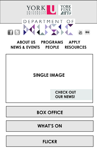
Just made a few quick mockups to show explain how my mobile version would function. When the user clicks on either “Box Office” or “What’s On” a drop-down menu appears with all the necessary information. When they tap either of these buttons again, the menus hide. When they tap the “Flickr” button, they are brought directly to the York U Music Flickr page.
Functional Mockup
This is my first attempt at developing my functional mockup. As you can see, it’s not exactly functional yet – I was having some problems formatting the text and got kind of hung up on that before continuing. For the next version, I realized I needed to do a CSS reset to avoid having all that weird leading.
This was a quick modified version I did just to learn how to use scaleable images. When you scale down the tablet size, nothing is in the right place except the main gallery image, which scales down to the size of the wrapper. Plus I fixed all the text! Yay!
This is the final version I will show in critique. It’s not my ultimate final version because I will still have to do some tweaking, but it’s working and everything is scaling to the correct sizes both in Firefox and Safari.
Mockup Tweaking
A bunch of things needed to be tweaked on my site. I saved out versions of my edits as I went so you would be able to see the decisions I made and why:

I had previously used yellow on “Flickr” and blue on “Box Office” – it was thought that maybe there was too much emphasis on Flickr with the yellow so I switched the two. Definitely less emphasis on Flickr now but I think it makes the page a bit unbalanced because there is so much weight on the left side now.
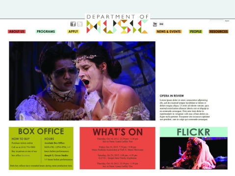
Tried to lighten that left side of the page a bit by trying other colours (pulled from my logo’s colour scheme) on the “Box Office” section, but that yellow/red/blue combo just worked so nicely together that I decided I wanted to keep all three and just find a way for them to look good.

Hit upon what I think is a good solution by making the “Box Office” blue, and switching the colours of “What’s On” and “Flickr” so “What’s On” is now yellow, and “Flickr” is now red. I think it works better because it’s now easier to read the “What’s On” information, and I think that yellow box draws the eye most, which is good because the “What’s On” section is the most important.
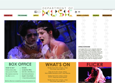
Andrew mentioned in critique that he didn’t like the white space to the right of the gallery and would like to see some triangles cascading down in a very light gray. Tried it out but didn’t love it – I don’t think it suits the geometric nature of my site and I think it makes it look a little to “craft blog-ish,” but I left them the layout for a bit to see if I’d get used to them.
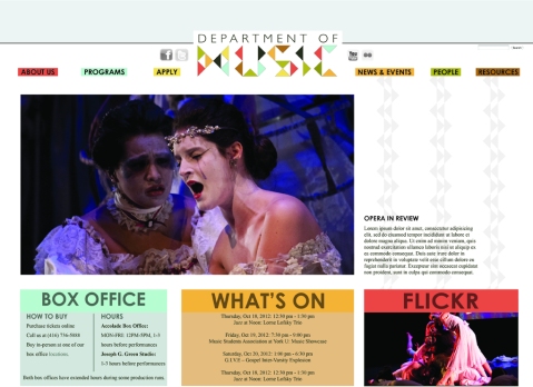
Tried adding light backgrounds on “Box Office” and “What’s On” to match the way the “Flickr” section has a distinct header/content division. Thought it made it a bit too busy in the end, but I’m glad I tried it because I was wondering how it’d look.

Tried making my bottom three boxes gray and retaining only the coloured headlines, but I found it made the entire page look weird and unbalanced.
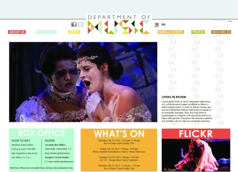
Tried cutting the text out of the boxes in white. Made the page look a lot lighter but also a lot more feminine. Since I know a lot of the fine arts departments have trouble drawing a male crowd (both as applicants and to events), I’m not sure whether or not this is a good aesthetic decision.
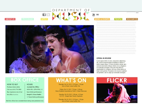
Even after leaving them on my layout for a while, I realized I didn’t think the cascading triangles in the white space didn’t really go with the look I am aiming for. Still wanted to keep trying, so I tried making a big patterned block of triangles but wasn’t crazy about it.

Thought maybe the problem with the block of triangles was that it didn’t extend down into the Flickr box so I tried that but still thought it looked a bit out of place.

Compared the version with white text to what I’d had originally (black text) and realized I liked the look of the black text MUCH better – I just think the white looks too much like a craft blog! However, I think the black might have been a bit harsh so I changed all the text in the buttons to a dark brown (the same one from the logo), which I think looks good. The buttons seem much more legible now that I’ve given them some padding, too.

The centered text on my “What’s On” box really didn’t look good before, so as per peoples’ suggestions, I left-aligned it along columns to match the “Box Office” box, and it looks much better now!
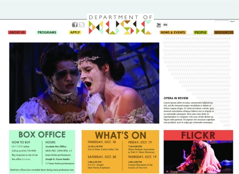
Still trying to fix that white space, I made the triangles do a sort of diagonal thing along one edge, but I’m still really not crazy about them – I feel like they just look sort of random and out of place.

In the end I decided to scrap the triangles in the white space. I was a bit hesitant about doing this, but I showed a few people both versions and asked if the white space bothered them, and none said it did, so I feel better about leaving it. I personally actually really liked the white space but was worried that it bothered other people. When it turned out that in the end, it didn’t bother many people, so I feel okay about leaving it. This is my final version of the screen site.
Functional Prototype
Here is my functional prototype. This was a bit of a horror story because I had thought it was going to be a bit more time-consuming than it actually was, so I finished the entire thing on Monday. Didn’t touch it again until today, when I went to put it on this process site and discovered that somehow ALL of my CSS was deleted. I just had an html file and two empty CSS documents. Panicked for a bit, then remembered I’d backed it up after I was finished. Checked my harddrive, and discovered that the files on there were also blank. Managed to redo the entire thing before class, but I still have no idea how those documents ended up blank, especially since I’d been saving them all along to test the site. Andrew, if you have any ideas on this please let me know!
Newest Moodboard
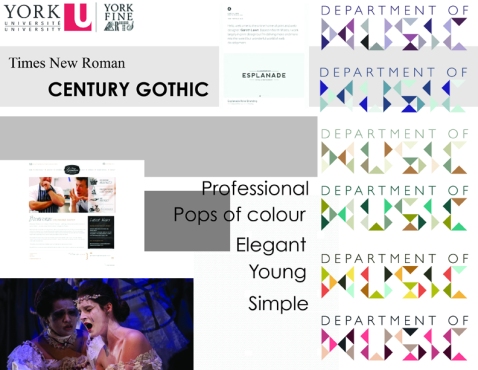
I just realized I didn’t post my latest moodboard! This is the one that my new look evolved from. I know it doesn’t look exactly the same, but this was definitely my starting point. I just decided to incorporate only the colours of the second-last logo (instead of my original plan of having the logo change each time the page is refreshed) and unfortunately the striped background didn’t end up working out. The rest (like the use of white space and the way the site is laid out, for example) stayed the same.
New Mockups
Decided to change the look of my site a little bit to make it more eye-catching. I started playing with the mobile layout because I figured it was the most difficult to do. I got a bit stuck when it came to the relationship of the colours to the background and topbar, so I just did a bunch of versions to compare:

Wanted to try something a bit more subtle with the type. It’s not supposed to be the focal point but it’s a bit overbearing in this one.

Liked this one a lot and really liked the textured background, especially how it looked under the menu buttons. But still not perfect since it was washing out the page.

Even though I liked the striped background, this ended up being my favourite. Still did some experimentation but I always ended up coming back to this one.

Was still a bit stuck on that striped background and was looking for ways to incorporate it. Here I tried turning the top bar white for contrast. Didn’t love it.
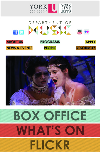
This is the last experiment I did. It looks a lot like the one I ended up choosing (white background), but this is a last-ditch effort to try to put those stripes in – I used them as background behind the buttons, but they didn’t show up very well and looked a bit busy.
Project 2 – New Wireframes`
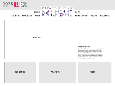
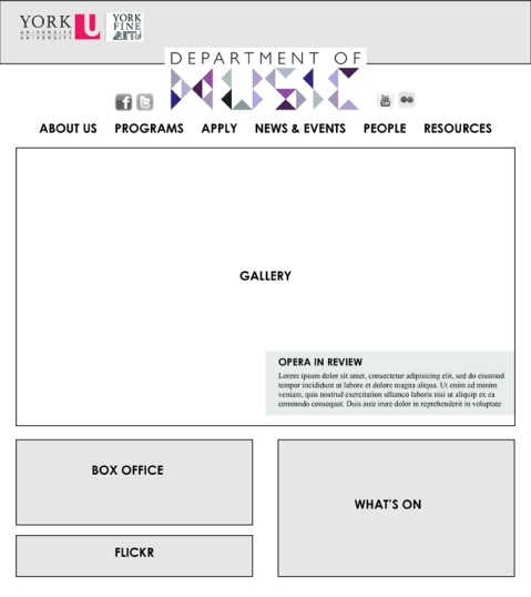
It was decided in critique that my wireframes need a bit more work before I start working too much on mockups. Sat down and finalized three of them (screen, handheld, mobile):
NOTE: In the tablet wireframe, the Flickr gallery becomes a button (might say something like “check out the pictures from our latest show!) that takes you directly to Flickr. This is the same for the site’s mobile version.
NOTE: For the mobile version of the site, the Box Office and What’s On Information collapse and expand when the user clicks on their respective buttons. As well, the gallery and newsfeed do not continuously change, so as not to waste the user’s data plan. Instead, the image is static and the button says “Check out the Music Department’s Latest News!” Clicking the button will take the user to the main news page.
Project 2 – More Process
Didn’t exactly love those first two moodboards I did, so I tried to come up with something better. Decided to play around with the Music Department’s logo to possibly spark some inspiration. I started off looking for fonts that were kind of quirky that I could play with:
I then started riffing off these fonts and just quickly created a few playful logos:
I had fun creating these, and liked some of what I came up with, but quickly realized I was getting a little bit unprofessional for the look of a university department’s website. My initial idea was that the page’s logo would change through these above logos each time the page was refreshed, so I decided to play on that and alter the colours of one logo so that each time the page refreshes, that logo would change colour:


