New Mockups
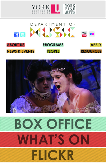
Decided to change the look of my site a little bit to make it more eye-catching. I started playing with the mobile layout because I figured it was the most difficult to do. I got a bit stuck when it came to the relationship of the colours to the background and topbar, so I just did a bunch of versions to compare:

Wanted to try something a bit more subtle with the type. It’s not supposed to be the focal point but it’s a bit overbearing in this one.

Liked this one a lot and really liked the textured background, especially how it looked under the menu buttons. But still not perfect since it was washing out the page.

Even though I liked the striped background, this ended up being my favourite. Still did some experimentation but I always ended up coming back to this one.

Was still a bit stuck on that striped background and was looking for ways to incorporate it. Here I tried turning the top bar white for contrast. Didn’t love it.

This is the last experiment I did. It looks a lot like the one I ended up choosing (white background), but this is a last-ditch effort to try to put those stripes in – I used them as background behind the buttons, but they didn’t show up very well and looked a bit busy.
